Review: Southern Bastards #1

I grew up in the Pacific Northwest. My exposure to the rest of the United States has been limited, mostly to vacations and short road trips. I’ve spent my entire life in Oregon and Washington, so I am keenly attuned to the quirks and flow of Northwest life. It’s a strange little place.

southern_bastards_review_01
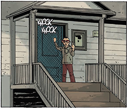
Almost all of my exposure to life in the deep South comes from fiction and media. I don’t have a lot of friends from there, and even my family primarily comes from the Midwest, although my dad spent a lot of time in New Mexico (New Mexico is it’s own, oddball world, though). The vast majority of southern fiction depicts a strange place, simultaneously intricately woven into the core American landscape and yet fundamentally separated from it. It’s a place of bible-thumpers and redneck gun-nuts and croc wrestlers and high-school football and barbecue. A place that rumbles a primal fear in as many people as romanticize it.

A place that the two Jasons – Aaron and Latour – are intimately familiar with.

That familiarity oozes into the atmosphere of their new Image book Southern Bastards. The story of Earl Tubb’s return to his home in Craw County, Alabama after forty years away bleeds that atmosphere, that knowledge, from every word bubble and every line. Aaron doesn’t hit you over the head with over-the-top vernacular, instead just sprinkling in the flavor of everyday speech – a man that still calls his father “daddy”; a waitress who calls her customer “hon”. It’s nice to see a depiction of rural southern speech that isn’t a caricature; the same deep yokel-speak that’s peppered through a lot of fiction set there.

Latour uses a deft touch in representing Craw County in a way that makes it feel unique. Much like the dialogue, there’s just enough flavor to show us the environment without feeling like a pastiche: a post-clock across from the brick facades of the town’s main street; the wood-panel siding surrounding the order window at the local barbecue joint; the muted greens and browns of a countryside that looks decidedly unfamiliar to someone like me, a born-and-bred Pacific Northwesterner.

southern_bastards_review_02
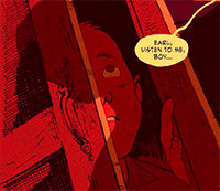
Earl’s homecoming is an uncomfortable one, a man returning to the place he’d grown up, now as much outsider as native. It’s a theme Jason Aaron is comfortable with, having honed his voice on his Eisner-nominated series Scalped. He pulls from that same well to give Southern Bastards it’s tension, the tightening-noose feeling of a man who just has a simple thing to do in a place he never wanted to be getting dragged into a situation he should’ve avoided all along.

Earl Tubb is part Ed Tom Bell, part Buford Pusser, and if this first issue tells us anything, it’s that things are going to get a lot worse for him before they get better. Aaron’s trademark slow-burn tension is well complimented by Latour’s oppressive, almost claustrophobic atmosphere. In the few words that Earl Tubb utters during this first issue he’s somehow already endeared to us, with such economy and subtlety that, by the time the issue is over, the hooks are set deep.

I have a lot of faith in Aaron’s storytelling capabilities. And, I’ll say it: I think his collaboration with Jason Latour has the makings of an even better partnership than what he had with R.M. Guerra. If you’re looking for a fine piece of Southern noir, and something completely different from any other book you’re reading right now, go pick up Southern Bastards.

Review: Sheltered #8

The first time I spoke with Ed Brisson about Sheltered was shortly after we interviewed him for Trade Secrets at Emerald City Comicon in 2013. At the time I thought the concept was really cool, but I was wary about how he might be able to pull it off. It was a narrow concept; a story set in a closed intentional community, and I couldn’t really wrap my head around what would drive the story beyond a group of paranoid preppers yelling at each other.

Holy shit, have they pulled it off.

sheltered_08_review_01The first of Brisson’s work I read was his 5-issue time-travel crime story Comeback. One of the things that makes Comeback so fantastic is the purposeful narrowing if it’s scope. It doesn’t concern itself with the end of the world or universe-destroying paradoxes or even the nitty gritty of sci-fi time travel science. It instead focuses on character moments and an intense crime story that happens to have a sci-fi twist.

And that’s exactly what he’s done with Sheltered. Sheltered‘s focus on character moments and minor crises is what keeps me turning pages. Lucas, the prepper colony’s de-facto leader after his coup in the first two issues, is a true believer in his cause. That belief makes him almost sympathetic at times, but fucking scary all the time. As we watch Lucas’s plan fall down around his ears, we’re given other characters to root for (Victoria), and even worse ones to hate (Curt).

Issue #7 set up the beginning of a chaos that Lucas can’t even hope to reign in. Issue #8 brings it all to a head, and builds to one of the best final page cliffhangers I’ve read in a while. It’s been a long time since I’ve stared wide-eyed at every page of a book, waiting for the other shoe to drop, and that’s exactly how I read Sheltered #8. After I finished, I actually uttered an out-loud “Oh… shit.”

Somehow, artist Johnnie Christmas has crawled into Brisson’s brain and pulled all of that tension out onto the page. Christmas’s art isn’t the clean-lined, cross-hatched work of a major superhero book. His linework has a grit to it that evokes more horror film than action flick, lending the perfect atmosphere to the cold claustrophobia of Safe Haven. His masterful touch with facial expression allows him to take “talking head” pages and imbue them with emotion that elevates the dialogue well beyond just the words being said. Couple that linework with Shari Chankhama’s fantastic, unique colors, and everything just falls into place.

sheltered_08_review_02Issue #8 lets us finally see a pressure valve open, venting just a bit of the tension that’s been building from the start, only to show us that it hasn’t released, only shifted position. Somehow, the creative team has diverted our attention from Lucas’s horrible takeover to Curt’s dangerously manic immaturity, and has us all holding our breath until we can be returned to the comparative normalcy of Safe Haven’s madness.

Sheltered, from the get-go, has been a slow burn. It has, thankfully, been allowed to evolve at a natural rate, and has done so without constant re-hashes or reminders of what’s going on. We’ve been given the opportunity to feel the fear and anxiety and paranoia of Safe Haven build into suspenseful nightmare, and it hasn’t even hit its peak yet. This is a fantastic book. Go buy it.

Advance Review: The Fuse #3

I need to preface this review by saying that I like The Fuse. I like it. Try to keep that in mind, because it may not seem that way for a bit…

fuse_03_cover_largeI am a huge fan of Antony Johnston’s Wasteland from Oni Press. What makes Wasteland so fantastic is the world-building; the atmosphere. It’s not the singular most original post-apocalyptic tale in the world – a post-crash drifter falls in with a scrappy group of survivors-on-the-run – but the world and the atmosphere that Johnston weaves into Wasteland makes it so much more interesting than its base subject matter.

That’s really what I was expecting with The Fuse. Unfortunately, I haven’t yet gotten that. We’re now three issues in, and although it’s a mildly entertaining murder mystery, it’s one that could’ve been set in any city, in almost any time period. The characters are so vanilla as to be easily transplant-able across genres, and the particulars of the story would take minimal adaptation to modern day, the old west, or medieval Europe.

It’s strange, really, to come across a story like this. The overarching ideas of the murder mystery – two lower-class citizens turn up dead, their murder unexpectedly linked to powerful elite – are so straightforward that I can’t really think of another setting in which it wouldn’t fit. Maybe that’s a testament to the timelessness of the story, but that’s not really what I’m getting from it.

The problem is that I’m just not connecting with the Fuse itself. The setting – an Earth-orbit space station large enough to be its own city – just isn’t felt enough in the story. Yeah, the victims are “cablers”, bottom-class citizens who live in the ductwork. Yeah, the “city” is full of effective refugees from Earth who came up to escape their history. But I just don’t feel it. I don’t know what it is, really, but I the atmosphere of a crowded space station just isn’t conveyed here.

Maybe it’s the artwork. I don’t want to blast Justin Greenwood for his art – structurally, it’s just fine. But so many scenes are in offices or medical facilities or someone’s desk, that I don’t get to see the actual Fuse enough. That, I think, rests on Johnston’s shoulders. We need to see more of the environment that normal Fuse-goers see. And even when we’re “outdoors”, I don’t get enough of the environment to make me go “Wow, that’s really a cool futuristic space station!” It’s all just kind of… blah.

The latest issue still pushes forward that murder mystery, and that part of the book is interesting. I almost wonder, though, if the book would be more engaging if it were set in a more vanilla setting and allowed the characters and plot to shine through. Setting this story in such a cramped, futuristic environment carries with it the expectation that that environment will be a major player in the plotline, and so far it just isn’t.

We get bits and pieces in issue three that help with the environment, but only a little bit. The murder mystery itself, through the first two issues, wasn’t quite enough to really set the hook in me. The story’s starting – just starting – to develop some momentum now, but I can’t help but wonder why the creative team bothered to write this tale into a futuristic, space-station setting like this.

I have a strong feeling, having read Wasteland and a bit of Umbral, that this story will pull together after 5 or 6 issues. Wasteland proved that Antony Johnston is skilled at – and fine with – the slow burn. Like I said at the start, I like The Fuse – but I’m not sure I’m willing to wait that long, when it comes to individual issues.

I like The Fuse. I do. But I desperately want to like it more than I do. The story is an interesting murder mystery. I’ll likely pick up the whole story when it comes out in trade. And, I guess, that’s my recommendation for other readers, too. I’m confident in Antony Johnston’s storytelling, but I’m not sure this particular story is suited for monthly episodes. Let’s just hope the atmosphere plays a bigger part in the coming months.

Comic Book Review: Revelations #1

This is a comic book review I wrote for Geekerific.com on January 3rd, 2014.

revelations_coverUntil I began doing some research for this review, I had absolutely no idea that Revelations is a re-print of a six-issue miniseries that was originally published by Dark Horse Comics in 2005. Which is surprising, because I love Humberto Ramos. I loved his work on Spectacular Spider-Man, DV8, Runaways, and even his vampire comic Crimson. His style is one of the most unique in the industry, and I find him sorely underused. Which is why, when I saw his name on the cover of Revelations #1 at my local comic shop, I picked it up with no prior knowledge.

In Revelations, writer Paul Jenkins crafts the story of the death of Cardinal William Richelieu on the grounds of the Vatican. Although the case seems cut-and-dry when ruled a suicide, Cardinal Marcel Leclair recruits his long-time friend, Scotland Yard investigator and self-proclaimed “prolapsed Catholic” Charlie Northern to take a look at the case. I am a bit curious why a Scotland Yard investigator is allowed any jurisdiction in Vatican City, but I’ll just let that one go for now.

Charlie Northern’s acerbic, chain-smoking, conspiracy-theory-loving detective plays a lot like a cross between Robert Langdon and John Constantine, in a very good way. He’s not as unlikable as Constantine nor as pretentious as Langdon, so it’s easy to get caught up in his distaste for his former religion and its trappings when he gets dragged to the seat of its power. Northern is really the only fleshed-out character in the first issue, and he’s surrounded by a somewhat one-dimensional supporting cast. I expect to see more from characters like Marcel and the antagonist Cardinal Toscianni, but the focus of issue one was squarely on Charlie.

The plotline plays much like a Dan Brown novel, as well – a crime thriller with a religious focus and high-conspiracy underpinnings. I’m glad I get to go into it without any knowledge of the previous publication, because it looks to be a fun ride.

And oh man, the artwork.

I’ll preface this by saying that if you already don’t like Ramos’s style, you’re not going to like it here. This book is VERY Humberto Ramos, but with a twist. In much the same way that Matteo Scalera’s art is transformed by Dean White’s painterly colors in Rick Remender’s new book Black Science, the coloring team of Leonardo Olea and Edgar Delgado take Ramos’s lines and create an entirely original look, dominated by pastels and colored pencil style sketch lines. The result is, while thoroughly steeped in Ramos’s exaggerated figure construction, a stunning and different direction for his art. This book looks absolutely fabulous.

The relative lack of information about the original publication may very well be why Boom! Studios chose to reprint it, especially with the talent attached. Although, it might also generate the question “Why reprint this?”. It’s rare for a company to re-serialize a book when they acquire it, so maybe they’re attempting to reach a wider audience and build hype prior to continuing the series beyond this first 6-issue arc. At least, that’s what I can hope.

I don’t know how the original print run sold, or even how many copies were printed, but I’m hoping it turns out to be a hit for Boom! Studios. I really enjoyed this first issue and love the potential it sets up. If you’re not turned off by a story set in the Vatican and all that that entails, go pick this one up.

Review: Revelations #1

revelations_coverUntil I began doing some research for this review, I had absolutely no idea that Revelations is a re-print of a six-issue miniseries that was originally published by Dark Horse Comics in 2005. Which is surprising, because I love Humberto Ramos. I loved his work on Spectacular Spider-Man, DV8, Runaways, and even his vampire comic Crimson. His style is one of the most unique in the industry, and I find him sorely underused. Which is why, when I saw his name on the cover of Revelations #1 at my local comic shop, I picked it up with no prior knowledge.

In Revelations, writer Paul Jenkins crafts the story of the death of Cardinal William Richelieu on the grounds of the Vatican. Although the case seems cut-and-dry when ruled a suicide, Cardinal Marcel Leclair recruits his long-time friend, Scotland Yard investigator and self-proclaimed “prolapsed Catholic” Charlie Northern to take a look at the case. I am a bit curious why a Scotland Yard investigator is allowed any jurisdiction in Vatican City, but I’ll just let that one go for now.

Charlie Northern’s acerbic, chain-smoking, conspiracy-theory-loving detective plays a lot like a cross between Robert Langdon and John Constantine, in a very good way. He’s not as unlikable as Constantine nor as pretentious as Langdon, so it’s easy to get caught up in his distaste for his former religion and its trappings when he gets dragged to the seat of its power. Northern is really the only fleshed-out character in the first issue, and he’s surrounded by a somewhat one-dimensional supporting cast. I expect to see more from characters like Marcel and the antagonist Cardinal Toscianni, but the focus of issue one was squarely on Charlie.

The plotline plays much like a Dan Brown novel, as well – a crime thriller with a religious focus and high-conspiracy underpinnings. I’m glad I get to go into it without any knowledge of the previous publication, because it looks to be a fun ride.

And oh man, the artwork.

I’ll preface this by saying that if you already don’t like Ramos’s style, you’re not going to like it here. This book is VERY Humberto Ramos, but with a twist. In much the same way that Matteo Scalera’s art is transformed by Dean White’s painterly colors in Rick Remender’s new book Black Science, the coloring team of Leonardo Olea and Edgar Delgado take Ramos’s lines and create an entirely original look, dominated by pastels and colored pencil style sketch lines. The result is, while thoroughly steeped in Ramos’s exaggerated figure construction, a stunning and different direction for his art. This book looks absolutely fabulous.

The relative lack of information about the original publication may very well be why Boom! Studios chose to reprint it, especially with the talent attached. Although, it might also generate the question “Why reprint this?”. It’s rare for a company to re-serialize a book when they acquire it, so maybe they’re attempting to reach a wider audience and build hype prior to continuing the series beyond this first 6-issue arc. At least, that’s what I can hope.

I don’t know how the original print run sold, or even how many copies were printed, but I’m hoping it turns out to be a hit for Boom! Studios. I really enjoyed this first issue and love the potential it sets up. If you’re not turned off by a story set in the Vatican and all that that entails, go pick this one up.

Review: Sex Criminals #1

I’m pretty lucky when it comes to spoilers. I’ve somehow managed to cultivate a group of online friends who are very spoiler-sensitive, so rarely does anyone randomly ruin my favorite comic or TV show. I still haven’t seen the finale to Breaking Bad, and I still don’t know anything about it.

Sex_Criminals_1_coverThis is important when it comes to Matt Fraction and Chip Zdarsky’s new comic Sex Criminals. Going into this one blind is, without question, the best way to experience it. If you know nothing but the title and the creative team – which is how I walked into it – the experience of having each little bit of the bulky opening issue’s story revealed without any foreknowledge is astounding. Which makes this review somewhat hard to write if I am to keep it spoiler-free (which I will). So, I’ll tread gingerly around story elements in the book and just stick to my opinions and my experience with it.

I love Matt Fraction’s work, for the most part. I love Casanova, his run on The Mighty Thor is stellar, Hawkeye is amazing, and Five Fists of Science is a must-read (but only if you like good comic books). Which is why I was disappointed when I read the first two issues of his other new Image book, Satellite Sam, and found it unapproachable and (for me) kind of boring.

So, after being stung, I was pretty wary going into Sex Criminals. Fraction is normally a writer whose work I’ll try out sight unseen (which is why I read Satellite Sam), but that experience gave me pause. Not enough to not try out his new book, mind you, but enough to make me reign in my expectations some.

This, combined with my complete lack of knowledge of the premise, made for one of the best comic book reading experiences I’ve had in a very long time. The premise of Sex Criminals – which I won’t reveal here in the hopes you can walk in un-spoiled – is simple and fun, and very adult. The combination of Fraction’s elegant and poignant writing and Zdarsky’s colorful and nearly-cartoony art-style make for a book that’s as funny as it is intriguing.

My only warning is that – as the name implies – it contains quite a bit of explicit content. So, if you’re not comfortable with the sexytimes, you might not enjoy this one.

I had a blast with the first issue of Sex Criminals. The hook is perfectly paced, the cliffhanger hangs at just the right point, and I am fully invested in Suzanne. Go check it out as soon as you can, try to walk into it with as little information as possible, and I think you’ll be as pleasantly surprised by it as I was.

Review: Rat Queens #1

I’m just going to get this out of the way right off the bat: I already love this book. See, I’ve been a gamer for most of my natural life. I was ten the first time I played a game of Dungeons & Dragons. It’s been a while since I’ve played it regularly, but even at 35 I’m still a huge fan and some of my fondest memories of gatherings with friends come from long D&D sessions.

rat_queens_1_coverMy history burdens me with a natural predilection toward fantasy stories. And although I love very traditional high fantasy fare, I can’t help but be tickled by anachronistic stories like The Princess Bride and Hansel & Gretel: Witch Hunters. In the comics world, it’s why I love Skullkickers so much, and now Rat Queens fits right into that canon for me.

Kurtis J Weibe, author of the critically acclaimed Peter Panzerfaust, hits all the right notes in this opening issue. The story centers around a group of mercenary ne’er-do-wells who, in order to avoid a dungeon sentence for destructive activity in Palisade’s town square, take on a simple sweep-and-clear of goblin caverns outside the city. What should’ve been a simple job turns complicated quickly, and that little twist is where we’re left hanging at the end.

Weibe doesn’t bother with stilted language or the typical medieval trappings of the fantasy genre, instead peppering the pages with modern language and hilarious epithets. At one point, Hannah uses a magical communication device that operates like a cell phone, receiving a poorly-timed call from her parents.

And it all works. Rat Queens knows what it is right from the start and doesn’t try to be anything else. There’s never a point where the story feels stilted or traditional, so you’re never really worried about the language or the modernized bits, because you just expect them to be there. The story revels in what it is without claiming to be something it’s not, and that makes it a wonderfully fun read.

rat_queens_1_inline_1Roc Upchurch, whose previous work includes the Image title Vescell, is a perfect fit for the style of Rat Queens. While I could go on for a while about the dynamism of his action scenes or his beautiful and unique renderings of each of the Queens, I’m going to focus for a moment on what I think is the most important aspect of his work: facial expressions.

There is so much sarcastic comedy in this book that would completely fall apart if the artist weren’t capable of rendering the appropriate expressions, and Upchurch just nails them all. From Betty’s dreamy-eyed remembrance to Violet’s mild annoyance to Hannah’s well-practiced bitchface, everything is right on key without being over the top. Rat Queens is littered with these little subtleties, and Upchurch’s renderings knock Weibe’s comedy out of the park.

Issue #1, and I’m hooked.

Review: Sheltered #1

sheltered_1_coverSHELTERED #1, $2.99, Image Comics
Writer: Ed Brisson
Artist: Johnnie Christmas
Colorist: Shari Chankhamma

Fiction is full of post-apocalyptic tales. As a species humanity is obsessed with its own extinction, developing hypothesis after hypothesis dealing with how it might happen. Natural disasters, economic collapse, civil unrest, climate change, or even zombies and giant monsters. Most people are content to live their lives with the apocalypse firmly rooted in their entertainment. Some, however, obsess over how to survive not if, but when, an apocalypse happens.

That’s the basic premise upon which Sheltered is built. A community of doomsday “preppers” has begun assembling an isolationist community in the wilderness, avoiding the entanglements of normal civilization while gearing up for its inevitable fall. While the adults in Safe Haven busy about preparing for possibilities, a group of teenagers know that the inevitable is just over the horizon.

The story centers around Victoria and Lucas, two teenage kids being raised in the tension and anxiety of the Safe Haven prepper community. They each have their own, wildly different take on their situation: Lucas, fully indoctrinated into the pre-apocalyptic mentality, has plans of his own that even his parents aren’t aware of. Victoria, a somewhat new addition, just wants to be a normal kid, but it doesn’t look like she’ll get her wish.

Ed Brisson (www.edbrisson.com), whose previous writing credits include his self-published noir series Murder Book as well as the critically acclaimed Image miniseries Comeback, succeeds at brewing the same sort of tension in Sheltered as he does with his crime stories, but with a different kind of paranoia. Like his noir, the first issue of Sheltered doesn’t give you a black-and-white portrait of who the good guys and bad guys are, instead presenting glimpses of each character’s personality and putting them into a situation that lets the reader begin to develop their own opinions (which I’m sure will be yanked out from under us later).

Relative newcomer Johnnie Christmas (www.jxmas.com) renders Safe Haven with beautifully minimalist lines, and his work with camera angles and shadows really draws the reader into the mounting menace as the issue moves forward. Characters are unique and easily identified, and his facial expressions – which always toe the “cartoony” line but never step over or feel out of place – are especially potent. Christmas’s art is well supported by Shari Chankhamma’s (www.sharii.com) sometimes unorthodox colors, whose palette and design compliment the action at every turn and really help the sense of both isolation and outright cold.

I’m an unabashed fan of Ed Brisson’s work on Comeback, and the first issue of Sheltered engenders the same sort of anticipation as Comeback’s opening issue. Adding to the mix is Brisson’s research of real-life prepper communities, which gives the paranoid state of Safe Haven just enough wackiness to be interesting, but grounding it in the real world in a very creepy way.

I’m in for the haul with Sheltered. I’m looking forward to see where Lucas’s plans lead the group, how Victoria’s personality will tie into it all, and to find out what happens when the rest of humanity falls apart and all we’re left with are the wackadoos.

Check out our interview with Ed Brisson and Johnnie Christmas in episode 47 of the Trade Secrets Podcast HERE

Playstation Vita Review

When you hold Sony’s new Playstation Vita, it leaves no room to question its purpose: this is a gaming machine. Everything about the design flows toward providing the best possible portable gaming experience, and in that arena Sony has succeeded brilliantly.

At first glance, the Vita looks alot like a PSP. It takes the elements of the PSP’s shape and design that worked – the large central screen, the high button and d-pad placement, the comfortable-to-hold curved outer edges – and retains them in a design that’s not as much larger than the original PSP as you might expect. That, however, is where the similarities end.

Everything in the PSVita’s design not only improves on its predecessor, but puts it to shame. The face buttons are nicely spaced and feel just right, and the d-pad is the best ever put on a Sony device. Gone is the 4-piece directional pad of the DualShock, replaced by one that – although aesthetically similar – is much more reminiscent of the pad from a Super NES controller, in all the best ways.

And let’s not forget the dual analog sticks. Discussions rage about the size and responsiveness of these two gorgeous little inputs, but all of them become moot about 5 minutes into a game of Super Stardust Delta. DualShock sticks they are not, and the nature of their miniaturization means that they come with a necessary adjustment period. Once that few minutes is over, though… wow. Springy, responsive, and accurate – these portable analog sticks have it all. I’ll admit that, at times, they can be a little touchy, but I haven’t encountered anything outrageous, or even frequent enough to be annoying.

And, for good measure, Sony slapped multitouch panels on both the front and rear of the device as well as tilt sensors. The front touchscreen is stellar, responding to the lightest touch (sometimes it responds even before I feel like I’ve touched it) and operating as smoothly as any iDevice. The rear touch panel feels like an afterthought, but what the hell – it’s there and it offers developers more choice, so more power to Sony. While the rear touchpad offers loads of potential, I haven’t encountered a really spectacular or necessary use for it yet. It works fine for zooming the sniper-rifle in Uncharted and for knocking around obstacles in Escape Plan, but I’ll be interested to see if anyone really makes it click.

The user interface is a departure for Sony, who chose to diverge from the last 7 or so years of the XMB into something much more touchscreen friendly. Sony’s new UI, much like their analog sticks, takes only a moment of adjustment before it all just makes sense. Imagine the iOS turned on its side: bubble-like application icons are arranged in three offset horizontal rows, and pages of apps scroll vertically rather than horizontally.

Multiple apps can be open simultaneously, and any that aren’t immediately in use are shifted to the side and suspended for easy retrieval. This is where horizontal scrolling comes in: a small row of icons at the top of the screen indicate how many apps are open, and a sideways swipe will take you to each one in order. If you have a lot open and just want to find a single one, a click of the PS button will arrange them all into slots on-screen, looking very similar to the old Xbox “blades”. Tap a “blade”, and you’re off to that app.

Tapping on any icon doesn’t immediately start the app, instead taking the user to what Sony calls the “Live Area”, an intermediate – and mildly ingenious – page containing a start button for the title surrounded, potentially, by all kinds of dynamically updateable content. The Live Area for each app or game has a few standard icons, including links to the manual and software updates. It can also contain web-links, trophy lists, deep links directly to in-game features, leaderboards, or virtually anything else the developer can think of. Closing a suspended app is as simple as touching the upper-right corner of the Live Area and “peeling” the page away to the lower-left.

The interface is slick, offering a wealth of information in a relatively logical and easy-to-navigate layout. Like any new OS it’ll take time to learn the syntax, but it really is a great design for the device, and simple enough to be inviting for new users. I’m especially fond of the Live Area, and the potential it presents. Imagine popping into the Live Area for a multiplayer title and seeing a list of games your friends currently have open, each one a deep link taking you straight there rather than navigating in-game menus. Or links to daily events or downloads of new content.

You encounter all of these bells and whistles the moment you pick up the Vita. You can muck around in the main menu all day, emitting little “hmm”s and “oooh”s as you go, but it’s not until you start up a game that the Vita shows it’s true colors. And what beautiful colors they are.

Gaming on the Vita feels like what portable gaming has always aspired to be. I’m not talking solely about console-quality gaming on-the-go, but that’s where I’ll start. We’ve had current-gen console-quality handhelds ever since the Sega Nomad and the TurboXpress, but the gaming experience on the Vita is like no other device on the market. Near current-gen quality graphics (which will only improve as devs learn the ins and outs of the system), more control interfaces than you can shake an analog stick at, and the most gorgeous screen ever put on a handheld gaming device, all adding up to as engrossing a gaming experience as you’ll ever find.

And that’s what’s really important: drawing the player in and making them ignore the world around them. Put in a pair of decent headphones, and you’ll quickly forget that you’re playing a handheld device. The Vita’s high-res 5-inch OLED screen is crisp and bright, and looks as good – if not better – than the screen on an iPad (although, admittedly, not as good as the iPhone 4’s retina display – but it’s damned close). Holding the Vita about a foot from your face (like most people will) results in an image equivalent to watching a 65-inch HDTV from about 12 feet – or about the length of most living rooms.

Yesterday, I sat on my couch and started playing a game of Uncharted: Golden Abyss at around noon, and didn’t stop playing until almost 2am. I’ve never been able to do that on any other handheld. Either my hands would cramp or my eyes would hurt or I’d just get bored. With the Vita, I felt just like I was playing Uncharted on the PS3, and only wanted to stop when I was too tired to play anymore – the device on which I was playing had faded into the background.

You’re probably wondering how I managed 14 hours of gaming on the Vita’s battery… Well, I didn’t – I was on my couch, so I was plugged in for that whole time. In my own personal experience over the last few days, I’ve been averaging around 4 hours of gaming per charge before I have to plug in, with the screen at about 75% brightness and Bluetooth turned off (although I wouldn’t be using it anyway). Wi-fi was on, and I’d access my trophies and friends lists amongst that time. 4 hours isn’t the best, but it’s not bad – and it’s about the same amount of gaming I get out of my 3DS with 3D turned on, so it doesn’t really phase me.

The price of Sony’s proprietary memory cards might be a challenge, especially if you want to download every game you buy like me. Different bundles can net you a memory card alongside the system (like the 3G Launch Bundle), but buying them standalone will cost you a minimum of $19.99 for 4GB, all the way up to $99.99 for 32. Yeah, that price is pretty outrageous, especially when the target audience for the Vita knows better; A 32 GB Micro SD card can be obtained for less than $1 per gigabyte. Your choice of memory card will be based entirely on your budget, and on how you intend to purchase games.

I went for the $99, 32 GB card because it’s my intention to never buy a single physical game for this system. I’ve heard the arguments: in order to recoup the cost of the memory card I’ll have to download at least 20 games which, on average, run about $5 cheaper than their physical counterpart. But the other thing I’m saving is space. I don’t need to keep boxes on a shelf (and yes, I understand the arguments of those who want the boxes, but that’s not me) and I don’t have to figure out extra storage space for cards. I can have a case that slips around just my Vita, and I’m good to go with my entire library. Besides – reaching 20 games isn’t going to be hard. I’ve already got seven.

When you move away from gaming on the device is where it shows its flaws, primarily with the preinstalled non-game related apps, which are almost universally rubbish. The web browser is awful, the music and video players are only adequate, and the photo app is hindered by mediocre on-board cameras. The worst miss of the lot, though, is Near, Sony’s pseudo-GPS fueled social app that supposedly has functions similar to Nintendo’s Streetpass, but good luck finding out how they work. The app is nearly (ha ha) incomprehensible, with a needlessly obtuse interface that could have been so much nicer if it had just been simple.

Some will be concerned about the price. Starting at $250, it’s getting up there for the average gamer. It’s a tad more expensive than other handheld devices, but it doesn’t come nearly up to the price category of devices like the iPad. But let’s remember: When that $250 price point was announced, against the then-$250 3DS, the gaming community was singing Sony’s praises. Only when the 3DS’s price was radically slashed did the attitudes of gamers and journos alike seem to backpedal. And keep in mind, it’s not $250 for a dumbed down or half-assed version of something better. The only question becomes: do you get your money’s worth?

Absolutely.

In a tech industry that is moving toward tablet devices that can do almost anything a casual user would want, gamers have been screaming about the dilution of their favorite pastime and the lost of the control mechanics that make more hardcore games unique. The Vita brings this all into sharp focus, giving us a device that’s built for gaming. It’s not a casual social tool, it’s not a tablet PC built for on-the-go word processing, it’s not a hyped-up e-reader, and it’s not a phone.

What it does offer is the potential to be all things to all gamers: a place where the hardcore can cut a dual-analog path of destruction through a South American jungle in search of fortune and glory, where fighting game fans can revel in a clicky and responsive d-pad to pummel opponents online, or where casual gamers can touch-screen their way through a backyard full of zombies or a field glittering jewels. While the PSVita has its flaws they are few and minor, and it triumphs at what is clearly the focus: gaming. Want classic games from a bygone era? It can do that (not yet, but it can, damnit). PSP games? Sure, why not. Touchscreen titles that you love from tablets or the iPhone? Yeah, it can do that, too. Oh, and full-fledged, cutting edge modern gaming titles with no compromises? Sure, the Vita’s got you covered. Online play, PSP games, trophies, and full PSN support including your friend list are all in there too.

The PSVita is close to ousting the Game Boy Advance SP Bright as my favorite portable gaming system of all time – and I’ve only had mine for five days. The launch lineup is brilliant (at least, for an American audience) showing off a little bit of everything the PSVita can offer. What’s really got me hooked is the PSVita’s potential, though: With a screen, UI, and controls that require no compromises, the system is capable of playing host to anything gamers want from the past and present, and offer developers worlds of possibilities for the future.

Review: Seven Warriors #1


Story by Michael Le Galli
Art by Francis Manapul

Seven Warriors, a historical fantasy tale set in the fictional north-African kingdom of N’nas Amon during the middle ages, begins at the fall of the capitol city of Tamasheq. Queen Tsin’inan recruits a crew of six female Sarmatian warriors to escort her son to the hidden city of Jabbaren, away from the danger of the impending war.

Amongst all of the historical references and abundance of apostrophes, Seven Warriors is a simple adventure tale. Le Galli laces the story with excessive dialogue at times, spending a few too many words explaining somewhat straightforward situations. The book begins on a sex-scene that the writing in the book never adequately explains, relying on artwork that doesn’t fully clarify its place in the story. The story picks up pace once the introduction to the world is handled, but perhaps not enough. The end of the book feels forced, ending in a cliffhanger that creeps up almost as an afterthought.

Francis Manapul’s art is strong throughout, evoking Michael Turner-esque style of his Aspen and Top Cow roots. The story is as much about its environments as its characters, and Manapul doesn’t skimp. From the ancient city of N’nas Amon to an alpine snowscape to a long-forgotten underground passage, the book’s environments are given solid attention to detail. Unfortunately it’s sometimes difficult differentiate some of the characters, leading to the aforementioned confusion regarding the book’s opening.

It is of note that the book is also presented in a strange square format, reminiscent of Archaia books like Mouse Guard, but still printed at standard size. This leads to large bars of blank white at the top and bottom of every page, almost like letterboxing, and feels like a lot of wasted space.

The last few pages of Seven Warriors can be forgiven when taken as a set piece in a larger tale. Although this wasn’t the strongest first issue, there’s potential for a fun medieval adventure if the right beats are put in place.